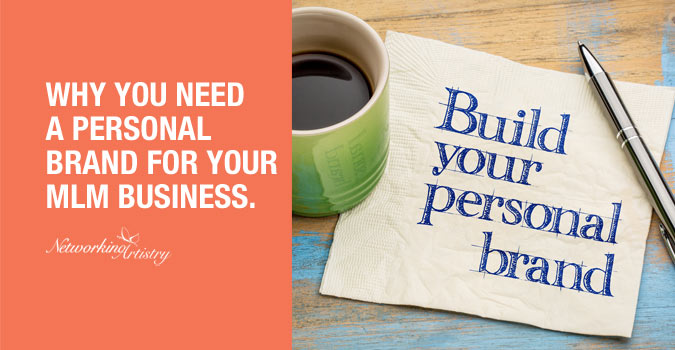
Have you ever visited a website and your first impression was like, “Wow, that’s a really nice site! It looks so professional and put together. It also has such a nice ‘feel’ to it. How can I get mine to look like that”? Well, continue reading to learn the Network Marketer’s Personal Branding Guide on how to Stand Out!
When you see brands that look so put together, where everything seems to match and be in harmony with one another, it’s because they follow a set of rules that were pre-defined to create that certain look and feel.
This is what’s known as brand identity. It’s created through the visible elements of a brand, such as colors, design, fonts, logo etc.
When put together, and used in a consistent manner, these elements will identify and distinguish your brand, creating recognition in the audience’s mind.
[thrive_2step id=’14609′] [/thrive_2step]
What You Will Learn.
This article is going to give you some insight on how this is done and how you can do it too.
After reading this article and downloading your free brand identity guidebook, you will have the know how to create a personal brand that’s unique and let’s you stand out from everyone else.
You will learn how to:
- Get a logo created.
- Choose a color palette.
- Create the mood or “feel” of your brand identity.
- Choose the right fonts.
- Create a brand style guide.
- Spruce up and “professionalize” your social media profiles.
Before we get started, I need to point out that branding and brand identity is a huge topic. There are dozens upon dozens of books written on the subject.
So with that said, I won’t be able to actually cover everything in this article.
My goal is to provide some tips, tricks and guidelines which will be enough to get you going on your own brand identity so you can get that pro look and feel you’re after.
And with some effort, you’ll be able to do most of it yourself, even if you don’t think you’re the creative type.
If you decide to outsource your logo, the free guidebook will provide advice on how to interact with designers to make the experience as smooth and painless as possible.
Also if you haven’t done so, I recommend you read our articles on why you need to create a personal brand and how to stand out with your brand.
It’s important that you know the reasons for having one, what value you bring and what makes your personal brand different and unique.
Let’s Clear Up Some Things.
A common misconception is thinking a logo is the brand. Another is using the terms Branding, Identity and logo design interchangeably. I’ll admit to being guilty of this too.
To be clear, a logo is not the brand. Neither is the identity. Branding, identity and logo design all play different roles that make up the whole, as the graphic shows.
When put together, they will form your audience’s perceived image of your business, products or services. Confusing, I know, but let’s break them down.
![]()
Brand.
Of the three, defining your brand is the most challenging because it’s the most abstract. And honestly, experts can’t even agree on a definitive answer either.
It’s especially difficult for us because what we’re doing is a little bit different. We’re branding ourselves. When most people think of brand, they usually associate it with a big company like Apple or Nike.
As a network marketer, your goal is to brand YOU, as in “YOU Inc”. So some of the definitions you find out there don’t apply to us as much.
When it comes to your brand’s logo design and identity development, you can dictate how you want the design to look, and how and where to position it in your marketing.
Branding on the other hand, is not dictated by you. Your audience determines what your brand will be, not you.
The way they determine this is through the relationship they form with your brand. Good or bad.
Factors like your story, aspirations, value and trust are things that form this relationship.
These factors by the way, are shared between you and your audience.
Just like you have aspirations, they have to match the aspirations of your audience as well for this relationship to blossom.
That’s as far as I’ll go into brand as I discuss it in greater detail here.
Logo Design.
A logo, short for logotype, is the identifier of your business in it’s simplest form.
It can be in the form of a symbol/icon, stylized typographical word(s) or a combination of the two.
Logos help with the recall, recognition and differentiation of your business from competitors.
They are also used as a way to express some of the essence and characteristics of your brand identity through the use of colors and fonts.
The logo also plays an important role in the development of your brand identity as elements of the logo can be applied to your website and collateral pieces. This will make up your overall branding identity system.
Brand Identity.
The most common use of identity are visual elements that form a part of your overall brand.
They can be your business card, brochure, flyer, product packaging, website, etc. Anything that gives a visual representation of your brand.
Other forms of identifiers can also be used. Audio for example can be a familiar jingle. Do you remember where “Plop, plop, fizz, fizz, oh what a relief it is” came from?
A catchy slogan is another brand identifier. Remember “Where’s the beef”?
Identifiers can also include smell or taste. Basically anything that can be used for an audience to recall or recognize a brand.
Generic example of visual brand identity.

Visible elements like colors, fonts, graphical shapes and icons, many times pulled from a logo are incorporated to create the entirety of your brand’s visual identity.
These elements will help bring recollection to your brand. This is how you differentiate and stand out from your competitors.
Notice how the example above presents collateral pieces that match and show consistency? Like they’re a part of the same family?
That’s one technique designers use to get that professional look and something you should always keep in mind when creating your own identity.
Now check this out. You don’t even have to use those fancy colored background shapes. Even if you stripped them out and simplified it, you’d still get this.

Cool right? Maybe not as exciting as the first example, but it still keeps a consistent, “family” feel, and in my opinion still looks pro.
So that’s a tip you can use to get that professional look. Even if your business is strictly online and you’ll never have a need for brochures or envelopes, keep the styles (colors, fonts, images, etc.) consistent on your website and you’ll be good to go.
Are You Doing this?
For offline network marketers, I’m sure you’ve spent your share at Kinkos printing flyers, business cards, invitations or what have you.
I want you to think back, did those marketing pieces match? Or were they haphazardly created?
A business card using this color, a flyer using that color, an invitation using this font, a sign using a different font?
Sound familiar? To some this may not matter and that’s ok. But to you I think it does otherwise you wouldn’t be reading this. And this is why you will set yourself apart from everyone else.
Establish Your Brand Identity.
Now it’s your turn. “Wait what? Do I actually have to learn to design too?!” Don’t let this part scare you off, it’s not as bad as you think. And no, you don’t have to be the next Paul Rand or Saul Bass.
Since our goal is to brand “YOU Inc.”, we will be focusing on your online branding because that’s where the majority of your audience will find you.
But everything you learn here today will be applicable whether you’re branding yourself offline, online or both.
A common beginner’s mistake is trying to mimick a competitor’s brand.
They see a successful network marketer’s blog and instead of focusing on developing a unique brand of their own, they do their best to emulate what they believe is already working for them.
So why not, if it works for them it should work for me. Let’s just copy them right? Not quite.
Remember, your goal is to stand out. To be different and unique so you’ll be remembered.
If you truly want to create an identity that provides you the opportunity to position yourself as an authority, creating an online presence that’s fresh and distinct from what everyone else is doing, is a great way to achieve this.
Creating Your Logo.
And now for the million dollar question. Do you really need a logo?
You know, while writing this article, I really pondered on this question.
Throughout design school and the 20+ years working in the industry, one thing was expected.
When developing brand identities for clients, designing a logo was a given. Just part of the process. So, the designer in me says, yes, every business should have a logo.
However, as an entrepreneur in the home based business niche, specifically network marketing, I had to ask myself, when was the last time a logo became a deciding factor for me to join a business or to buy products from a MLM company?
You also need to ask yourself, when was the last time you decided to do business with someone specifically based on their logo? Probably never right?
Would it hurt your business and personal brand to have one? No, but it would probably help. Would it prevent you from having success if you didn’t have one? Absolutely not.
How do I know this? Because there are plenty of network marketers (offline and online) who have achieved high levels of success with their personal brands without ever having one.
And besides, a logo that’s recognized by your audience is only a result from the success in the relationship you establish with them. The logo is not the reason for that success.
So I’m gonna say this one’s optional. I do think it’s a good idea to have one though since the whole point of this branding article is about standing out. Having a logo will definitely help in that department but I’ll leave this one to you.
Keep in mind, designing an effective logo is not an easy thing, even if you’re the creative type. It takes knowledge in typography theory and icon development.
There are also certain rules and guidelines that need to be followed which are covered in your free brand identity guidebook. Make sure to download your copy!
Outsourcing.
Because effective logo development takes a certain skill set, I highly recommend you outsource the logo design if you can. Fiverr.com is an awesome resource to get a logo designed if you’re on a tight budget.
Sort through the designers there and look at their design work. Designers normally have a certain style to their work so pick one that resonates with you.
Download your free guidebook as it gives more advice on working with designers. This will make the whole process of working with one easier and as painless as possible. Plus they’ll love you for being prepared!
[thrive_2step id=’14609′][/thrive_2step]
Define Your Color Palette.
So now that we’ve agreed a logo is optional (but recommended), let’s go ahead and discuss choosing your color palette.
When it comes to visual elements, colors are the one thing we as humans probably associate with the most.
The emotions color can evoke are usually brought on by our cultural backgrounds and upbringing.
Color is an element that your audience will very much associate with your brand.
And once they make that association, assuming you define and apply your palette correctly, they’ll be able to spot and recognize your content anywhere on the internet. This is known as brand recognition.
Color is also a very subjective thing. What I might find attractive, you may not like at all.
But one thing’s for sure. Color definitely evokes emotions one way or the other and it plays an important role when people buy.
Research conducted by the Seoul International Color Expo 2004 suggested that:
- 92.6% surveyed said they put the most importance on visual factors when purchasing products.
- 84.7% of the total respondents think that color accounts for more than half among the various factors important for buying products.
Research conducted by Xerox Corporation and International Communications (2003):
- 92% believe color presents an image of impressive quality.
- 90% feel color can assist in attracting new customers.
- 90% believe customers remember presentations and documents better when color is used.
- 83% feel color makes them appear more successful.
- 81% think color gives them a competitive edge.
- 76% believe that the use of color makes their business appear larger to clients.
And Even More Research:
- People make a subconscious judgment about a person, environment, or product within 90 seconds of initial viewing and that between 62% and 90% of that assessment is based on color alone.
Source: CCICOLOR – Institute for Color Research
- Ads in color are read up to 42% more often than the same ads in black and white.
Source: White, Jan V., Color for Impact, Strathmoor Press, April, 1997
The statistics show just how visual humans are, and how large a role colors play in our decisions. And why having a color palette, used in a consistent manner, will increase the chances of your brand getting noticed and standing out from everyone else.
The Meaning of Colors.
Colors produce different psychological sensations and emotions with people.
Since colors can and do have different meanings between cultures, I’ll be using the western world’s perspective.
For example, in the west, the color black can represent death, whereas in China and Japan, it’s the color white.
Side note: There’s a debate on whether Black and White are considered colors. We’re not gonna get into that here, so for our purposes, we’ll consider them colors.
Here’s a basic breakdown of colors and some of their meanings.
- Red: Confidence, assertion, passion, power, courage, driven, determination and strength
- Blue: Loyalty, trust, integrity, reliability, peaceful, and authority.
- Green: Growth, renewal, practical, compassion, flexible, calmness and dependability.
- Yellow: Cheerful, happiness, uplifting, wisdom, playful and logical.
- Purple: Noble, luxurious, unusual, mysterious, inventive, originality and calming.
- Orange: Adventurous, creative, cheerful, independent, determination, attraction and balance.
- Brown: Stability, comfort, practical, strength, dependable, durable and natural.
- Black: Authority, power, strength, formal, protective, sophistication and elegance.
- White: Pure, new, simple, innocent, peaceful, safe and cleanliness.
Defining Your Color Palette.
When choosing your color palette, you’ll want to pick 5 to 6 colors to define your brand. Your palette can be broken down using the following.
- Dominant color. This is the primary color that’s associated most with your brand. Your logo should incorporate this color.
- Subordinate color. This is your primary action color. This is what you will use for your links, call to action buttons or anywhere else your audience can take action. You want to subconsciously train your audience so when they see this color, they know there is an action to take.
- Light and Dark color. This can be used for your background and text.
- Accent color. Lastly you’ll want to choose 2-3 accent colors. These can be used when you want to highlight or accentuate something. To add a little pizazz or spice to your basic color scheme.
Once your colors are defined, it’s important that you stick to this palette. Don’t deviate.
Even when selecting imagery, try to use images that match your color scheme. Stay within the same color range. For example, if your palette is made up of pastel colors, don’t muck it up by adding images that have bright neon colors.
It just won’t match and will look out of place. Plus it could make your brand look amateurish.
I know I’ve said this enough times, but stay consistent! This is extremely important. It’s this consistent repetition that will get your brand’s color palette ingrained into your audience.
Sample Color Palettes.
Now let’s take a look at some examples. Use these for inspiration and to get some ideas when coming up with your own.
There’s no right or wrong here, remember it’s all subjective. The titles I added are the emotions I personally get from them. Yours might be different. Try to pay attention to any feelings or emotions these evoke in you.
Bold Colorful Festival.

Breezy Tropical Feel.

Hazy gloom.

Frozen Pastels.

Spring Bloom.

Nature’s Beauty.

Did you get some ideas? Good, now it’s your turn. Coming up with colors can seem intimidating but let’s try to make it easier on you. Here are some free online color generators to help you out.
Coolors.co
This website offers a free color generator. It has a short instructional video that will show you how to use it.

Adobe Color CC.
If you already have an image with a color scheme you like, Adobe Color CC is a neat free color generator that lets you upload an image and will generate a color palette for you based on the colors of your image.
Below is an example of a photo I uploaded and the color palette it produced.

Once you get your palette generated, make sure to write down the web colors or Hex color codes. You will need them when creating your style guide which we’ll go over a little later.
If you need more color ideas, this site has 50 color palettes to give you even more inspiration.
The most successful color palettes are those that develop your brand’s identity and clearly convey the right message to your audience.
Side note: If you do decide to create a logo, or have one made down the road, the primary color in your palette should also be reflected in your logo.
Choose Your Fonts Well.
It’s the little details that can have a dramatic effect in the way people perceive brands. We’ve already established that visuals play a large role in a buyer’s decision making.
Fonts, like colors, also play an important role in the look and feel of your site. The fonts you choose have to be appropriate for what you’re trying to convey to your audience.
There are three fonts you’ll want to define for your brand. These are:
- Primary or Headline Font: This is used for just that, headlines. This is also the font you’ll want to use on your visuals. Try to stick to only a serif or san-serif font. Try not to get all crazy with this like using scripts as they can be difficult to read.
- Secondary or Subhead Font: You want to find a font that pairs well with your headline font, that can be used for accents.
- Tertiary or Body Font: This is the font that will be used for your main content. Out of the three, it’s important to keep this font as simple and readable as possible. You don’t want your audience struggling to read your content. They will leave! Trust me on this one.
Make sure the fonts you choose match the style and feel of your brand.
For example, if you’re going for a modern look, you may not want to choose a font like this that screams medieval Knights drinking goblets of ale.

But most importantly, make sure the fonts are easily readable. Choosing wrong or hard to read fonts, or using too many different fonts can determine whether a visitor stays on your site or leaves.
It will also determine whether they take you seriously or not and if they’ll ever come back at all.
Font Character.
Here’s another example. Let’s say your site sells luxury items. Dolce & Gabbana is known as a luxury brand.
What do you think would happen if you put an ad on your sight using a font like this? What will your audience think?

Does the character or personality of that font give off a luxury feel? To me it looks more like something you’d see in a toy store or cartoon.
Also that font is kind of hard to read. Can you imagine if someone used a font like that or some other hard to read font throughout their body copy?
“Oh come on Mike, that’s just common sense. Surely no one would do such a thing.”
Really?

Source: Liberty Van
Ahem, cough, cough…

Source: Penny Juice
Would you actually try to read that? No offense to the owners of these sites, but c’mon. Granted, these are extreme examples, but I hope you get the picture.
Fonts absolutely do make a difference to the look, feel and readability of your site and marketing materials.
Remember, fonts have their own character and personality. Depending on the font used, it will give off a different impression of your website and your brand. And like colors, fonts evoke different emotions in people, so choose carefully.
Tips on Choosing Fonts.
If you’re not sure what fonts to use, just play it safe. When it comes to body text, a safe bet is to use a non-gimmicky, legible and formal typeface.
Common fonts like Helvetica, Arial, Verdana, and Tahoma for sans-serif fonts are always safe. For serif fonts, you can’t go wrong with Times, Palatino and Garamond.
Don’t use all uppercase for your body copy. It’s extremely difficult to read. (see the Penny Juice example above)
Try not to use white body copy on colored background. That can also be difficult to read, especially when reading on a screen. (again see the Penny Juice example)
I’m talking about the majority of a site’s body content here. White headlines are ok when used appropriately.
Whatever fonts you decide on, try to keep them understated and make sure it doesn’t upstage your actual content.
Here’s an infographic from Crazyegg.com showing different emotions people can get from various fonts.

Create a Mood Board.
A great way to brainstorm your brand’s look and feel is to create a mood board. A mood board is a type of collage that can consist of text, photos, colors and samples of objects that are laid out into a sort of composition.
Like the name, it will create the “mood” or “feel” that captures the emotions you want your brand to convey to your audience.
The images don’t even have to be about your niche. It can be any image as long as it captures the mood you are going for.
Mood boards are what designers will present to clients as a precursor to starting the actual design concepts.
They do this to make sure the clients are on board to their initial ideas, (feel, color scheme, etc.) before spending time on designs that could be completely off from their client’s expectations.
This is an optional action step and is not really necessary for you to take. I just thought to introduce it in case you wanted to try it. Here’s an example.

Source: www.skillshare.com
Here’s a free online mood board creator that you can share to get opinions from friends. Another free platform you can use is Pinterest. You can get a ton of great ideas from there.
Branding Style Guide.
Now that your colors, fonts and “mood” have been defined, it’s time to organize and document everything.
Your brand style guide is an essential document that will ensure a consistent look and feel throughout all of your marketing collateral moving onward.
With a style guide, you will lock-in your brand’s color palette, fonts, icons, photos, etc. This will become your “rules” book that will force you to keep a consistent look throughout your brand identity. Once defined, it’s important you don’t stray from these guidelines.
Remember the Kinkos example I gave? About flyers, business cards and invitations using different fonts and colors? Your style guide will prevent you from doing this and will ensure your marketing materials look consistent and are congruent.
Another advantage to creating a branding style guide is, if you ever have a need to hire a designer, you can give them your style guide. This gives the designer a set of guidelines to let them know what they can and cannot do with your identity.
Check out frontify.com. It’s a cool site for creating your style guide. It allows you to create up to 3 style guides on their free option. It also let’s you share your completed guide so you can send it to friends for feedback or to a freelancer when you need work done.

Consistency.
Oh brother, here he goes again. I know, I know. I’ve brought this up a lot already but I just want to stress how important this is to your brand identity. This is what will determine whether your brand is remembered and considered professional or amateurish.
Anytime you want to create something new, always refer to your style guide. This will ensure everything you do with your brand identity moving forward will stay consistent.
Take those styles and apply them to your social media profiles or Facebook ads so anytime your audience sees them, you are training them to recognize your brand.
Get Feeback.
I’d like to end with this point. Like colors and fonts, logo design and design in general are all subjective.
Before publishing your website, logo or any piece of marketing collateral to the world, it’s important to get feedback.
First impressions count and can be a deciding factor whether your audience returns to your blog.
It’s understandable that we all want to think our brand identity is a masterpiece of Sistine Chapel proportions. But what does your audience think?
Try to get as much feedback from people you trust. Make sure the feedback is honest and specific. Don’t settle for responses like, “It looks good” or “I don’t like it”.
Ask them why they think it looks good or what they don’t like about it. Their feedback will come from an outsider’s perspective that could provide valuable insight you never considered.

The above image is meant to be lighthearted but also to make a point. Ultimately it’s not about what you like that matters, but the user experience of your viewers that takes precedence. So be open to feedback and make adjustments as needed.
Wrapping it Up.
Well, this should be enough to get your brand identity up and running. If you implement what we discussed here, you will already be ahead of most.
It’s a process that takes time and effort, but a very necessary one if you’re serious about your business and standing out. Always remember, first impressions count to your audience.
Impress them with your brand identity, then knock their socks off with your value driven content.
[bctt tweet=”Impress them with your brand identity, then knock their socks off with your content.” username=”netwrkingartist”]
Did we miss anything in this article you’d like us to cover?
Are you gonna take action on this? Who knows, you might actually have fun with it.
Anyway, we hope so and we wish you happy branding!
Don’t forget to download your free branding identity guidebook as it covers more topics and exercises not discussed here.
[thrive_2step id=’14609′][/thrive_2step]
If you found value, we’d appreciate it if you could share your thoughts below and also share on Facebook and Twitter.
- Stand Out! A Guide to Creating a Unique Personal Brand Identity. - December 24, 2016
- How to Brand Yourself to Stand Out in an Overcrowded Market. - December 19, 2016
- What’s a Personal Brand and Why You Need One for Your Business. - December 12, 2016